IupFlatLabel (since 3.25)
Creates an interface element that is a label, but it does not have native
decorations. Its visual presentation can contain a text and/or an image.
It behaves just like an IupLabel,
but since it is not a native control it has more flexibility for additional
options.
It inherits from
IupCanvas.
Ihandle* IupFlatLabel(const char *title); [in C]
iup.flatlabel{[title = title: string]} -> ih: ihandle [in Lua]
flatlabel(title) [in LED]
title: Text to be shown to the user. It can be NULL. It will set the TITLE
attribute.
Returns: the identifier of the
created element, or NULL if an error occurs.
Inherits all attributes and callbacks of the IupCanvas,
but redefines a few attributes.
ALIGNMENT (non inheritable): horizontal and
vertical alignment of the set image+text. Possible values: "ALEFT", "ACENTER" and "ARIGHT",
combined to "ATOP", "ACENTER" and "ABOTTOM". Default: "ALEFT:ACENTER". Partial
values are also accepted, like "ARIGHT" or ":ATOP", the other value will be
obtained from the default value. Alignment does not includes the padding area.
BACKIMAGE (non inheritable):
image name to be used as background. Use
IupSetHandle or
IupSetAttributeHandle to
associate an image to a name. See also
IupImage.
BACKIMAGEZOOM (non inheritable):
if set the back image will be zoomed to occupy the full background. Aspect ratio
is NOT preserved. Can be
Yes or No. Default: No. (since 3.25)
BORDER (creation only):
the default value is "NO". This is the IupCanvas border.
BGCOLOR: ignored. It will use the background color of the native parent.
EXPAND (non
inheritable):
The default value is "NO".
FGCOLOR: Text color. Default: the
global attribute DLGFGCOLOR.
FITTOBACKIMAGE (non inheritable):
enable the natural size to be computed from the BACKIMAGE. If BACKIMAGE is not
defined will be ignored. Can be
Yes or No. Default: No.
FRONTIMAGE (non inheritable):
image name to be used as foreground. The foreground image is drawn in the same
position as the
background, but it is drawn at last. Use
IupSetHandle or
IupSetAttributeHandle to
associate an image to a name. See also
IupImage.
IMAGE (non inheritable):
Image name. Use
IupSetHandle or
IupSetAttributeHandle to
associate an image to a name. See also
IupImage.
IMAGEINACTIVE (non inheritable):
Image name of the element when inactive. If it is not defined then the IMAGE
is used and its colors will be replaced by a modified version creating the
disabled effect.
IMAGEPOSITION (non inheritable):
Position of the image relative to the text when both are displayed. Can be:
LEFT, RIGHT, TOP, BOTTOM. Default: LEFT.
PADDING: internal margin. Works just like the MARGIN attribute of
the IupHbox and IupVbox containers, but uses
a different name to avoid inheritance problems. Default value: "0x0".
Alignment does not includes the padding area.
CPADDING: same as PADDING but using the units of the
SIZE attribute. It will actually set the PADDING attribute. (since
3.29)
SPACING (non inheritable): spacing between the
image and the text. Default: "2".
CSPACING: same as SPACING but using the units of the
vertical part of the
SIZE attribute. It will actually set the SPACING attribute. (since
3.29)
TITLE (non inheritable):
Label's text. The '\n' character is accepted for line change.
TEXTALIGNMENT (non inheritable):
Horizontal text alignment for multiple lines. Can be: ALEFT, ARIGHT or ACENTER.
Default: ALEFT. (since 3.22)
TEXTWRAP (non inheritable): For single
line texts if the text is larger than its box the line will be automatically
broken in multiple lines. Notice that this is done internally by the system, the
element natural size will still use only a single line. For the remaining lines
to be visible the element should use EXPAND=VERTICAL or set a SIZE/RASTERSIZE
with enough height for the wrapped lines. (since 3.25)
TEXTELLIPSIS (non inheritable):
If the text is larger that its box, an ellipsis ("...") will be placed near the
last visible part of the text and replace the invisible part. It will be ignored
when TEXTWRAP=Yes. (since 3.25)
TEXTORIENTATION (non inheritable): text
angle in degrees and counterclockwise. The text size will adapt to include the
rotated space. (since 3.25)
ACTIVE,
FONT,
EXPAND, SCREENPOSITION,
POSITION,
MINSIZE,
MAXSIZE,
WID, TIP, SIZE,
RASTERSIZE,
ZORDER, VISIBLE,
THEME:
also accepted.
The IupFlatLabel can contain text and image simultaneously.
The natural size will be a combination of the size of the image and the
title, if any, plus PADDING and SPACING (if both image and title are present).
The IupLabel SEPARATOR attribute to configure a separator
(horizontal or vertical lines) is not supported. ELLIPSIS, MARKUP and WORDWRAP
IupLabel attributes are also not supported. Mnemonics are not
supported.
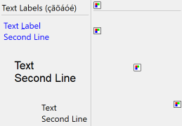
Browse for Example Files
| Normal Text Label - |
 |
- Normal Image Label |
| |
|
FGCOLOR = "0 0 255"
ALIGNMENT="ALEFT:ATOP" |
ALIGNMENT = "ALEFT"
(8bpp Image) |
FONT = "Helvetica, 14"
ALIGNMENT = "ACENTER:ACENTER"
TEXTALIGNMENT = "ACENTER" |
ALIGNMENT = "ACENTER"
(24 bpp Image) |
| ALIGNMENT = "ARIGHT:ABOTTOM" |
ALIGNMENT = "ARIGHT"
(32 bpp Image) |
IupImage, IupButton, IupToggle,
IupLabel
