The Two Types of Gauge
Creates a Gauge control. Shows a percent value that can be updated to simulate a progression. It inherits from IupCanvas.
(Migrated from the IupControls library since IUP 3.24, it does not depend on the CD library anymore.)
Ihandle* IupGauge(void); [in C]
iup.gauge{} -> (ih: ihandle) [in Lua]
gauge() [in LED]
Returns: the identifier of the created element, or NULL if an error occurs.
BACKCOLOR (non inheritable): color of the background inside the borders. Predefined to "220 220 220. Can be NULL. When NULL it will use the parent's background color. (since 3.28)
CANFOCUS: enables the focus traversal of the control. Default: NO. (different from IupCanvas)
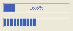
DASHED: Changes the style of the gauge for a dashed pattern. Default is "NO".
FGCOLOR: Controls the gauge and text color. Default: "0 120 220" (changed in 3.28).
FLAT: use a 1 pixel flat border instead of the default 3 pixels sunken border. Can be Yes or No. Default: No. (since 3.21)
FLATCOLOR: color of the border when FLAT=Yes. Default: "160 160 160". (since 3.21)
MAX (non inheritable): Contains the maximum value. Default is "1".
MIN (non inheritable): Contains the minimum value. Default is "0".
ORIENTATION (creation only): can be "VERTICAL" or "HORIZONTAL". Default: "HORIZONTAL". Horizontal goes from left to right, and vertical from bottom to top. Width and height are swapped when orientation is set. (since 3.27)
PADDING: internal margin. Works just like the MARGIN attribute of the IupHbox and IupVbox containers, but uses a different name to avoid inheritance problems. Default value: "0x0". (since 3.0)
CPADDING: same as PADDING but using the units of the SIZE attribute. It will actually set the PADDING attribute. (since 3.29)
SHOWTEXT: Indicates if the text inside the Gauge is to be shown or not. If the gauge is dashed the text is never shown. Possible values: "YES" or "NO". Default: "YES".
SIZE (non inheritable): The initial size is "120x14". Set to NULL to allow the automatic layout use smaller values.
TEXT (non inheritable): Contains a text to be shown inside the Gauge when SHOW_TEXT=YES. If it is NULL, the percentage calculated from VALUE will be used. If the gauge is dashed the text is never shown. When ORIENTATION=VERTICAL text is drawn in 90ş.
VALUE (non inheritable): Contains a number between "MIN" and "MAX", controlling the current position.
ACTIVE, BGCOLOR, EXPAND, FONT, SCREENPOSITION, POSITION, MINSIZE, MAXSIZE, WID, TIP, RASTERSIZE, ZORDER, VISIBLE, THEME: also accepted.
MAP_CB, UNMAP_CB, DESTROY_CB: common callbacks are supported.
To replace a IupProgressBar by a IupGauge you should set RASTERSIZE=200x30 and SHOWTEXT=NO.
The Two Types of Gauge